A fine balance
Groot PhesanteskraalA story by
Ulrike Meier
A fine balance:
Vollherbst provides a refined, and über-detailed, solution
When Durbanville winery, Groot Phesantekraal, sought to honour their 120-year heritage with a wine label that bears the Brink family crest, they knew that detailing – and attention to detail – would play an important role. “We knew the quality on the label had to reflect the quality in the bottle,” says co-owner Ronelle Brink. For the brand this quality is found at the almost elusive place where everything is in perfect balance. The principle of ‘lagom’, a Swedish term which means ‘the right amount is best’ was to guide design and labelling solutions.
Vollherbst was called in to achieve this ‘fine balance’ with a refined technique that captured the delicate quality of the brand.
Step 01
Brand
The grapevine refiner
and his Pinot Noirs
Groot Phesantekraal has a strong familial heritage that dates back to the 1600s, with the farm sold to the present-day Brink generation in 1759, when Arend Brink became the first Brink custodian.
Today, the Brinks – fourth-generation Andre and wife Ronelle - have converted the successful cattle, sheep and grain farm to also include vineyards. Their boutique winery under the expert management of Etienne Louw of Altydgedacht has established a niche for itself in the Durbanville wine valley – and they continue to impress with a line of brilliant wines; the fruit of the Brinks’ dedication and personal involvement in the daily running of this estate.
Step 02
Challenge
Show classy
authenticity
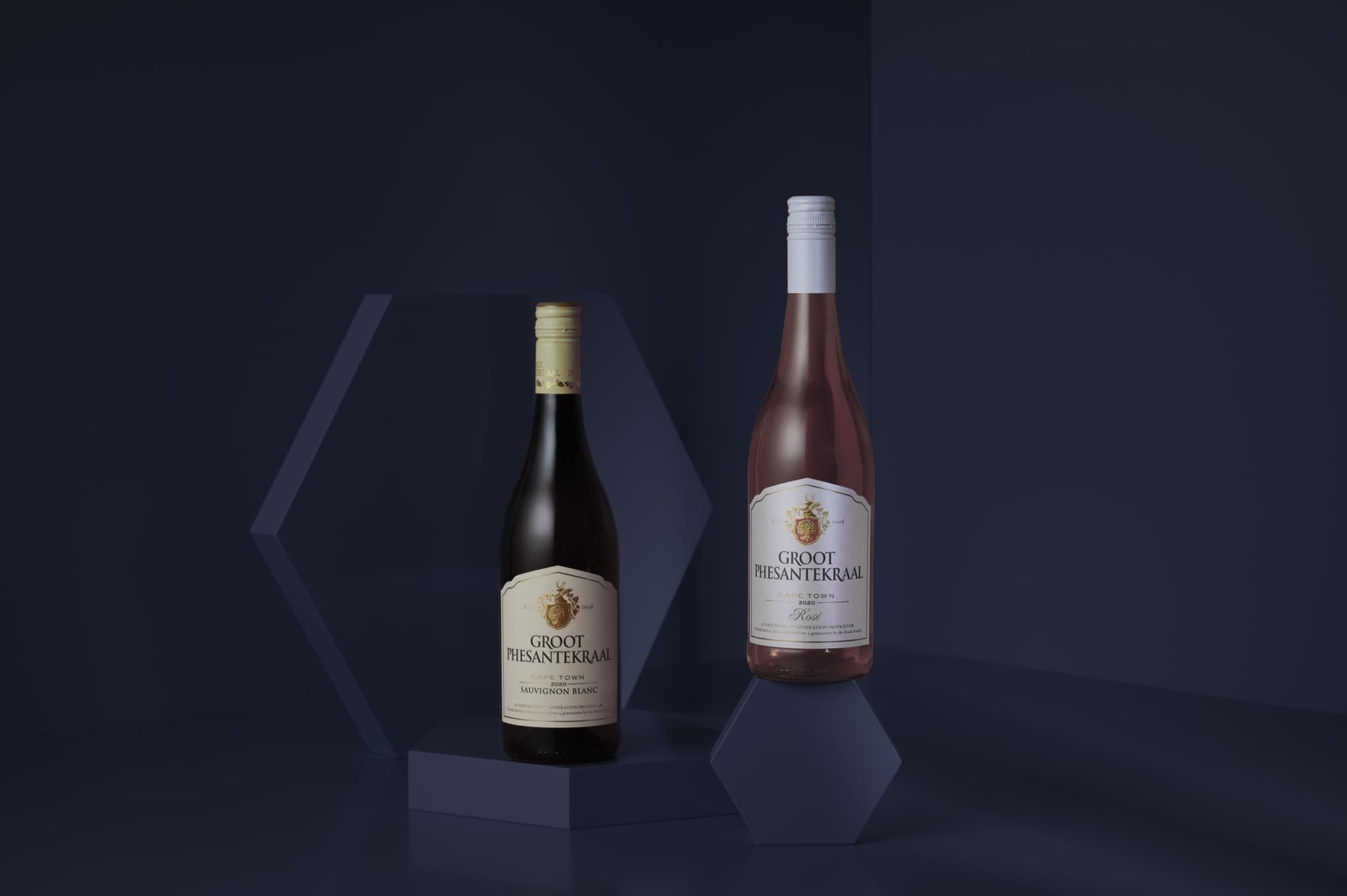
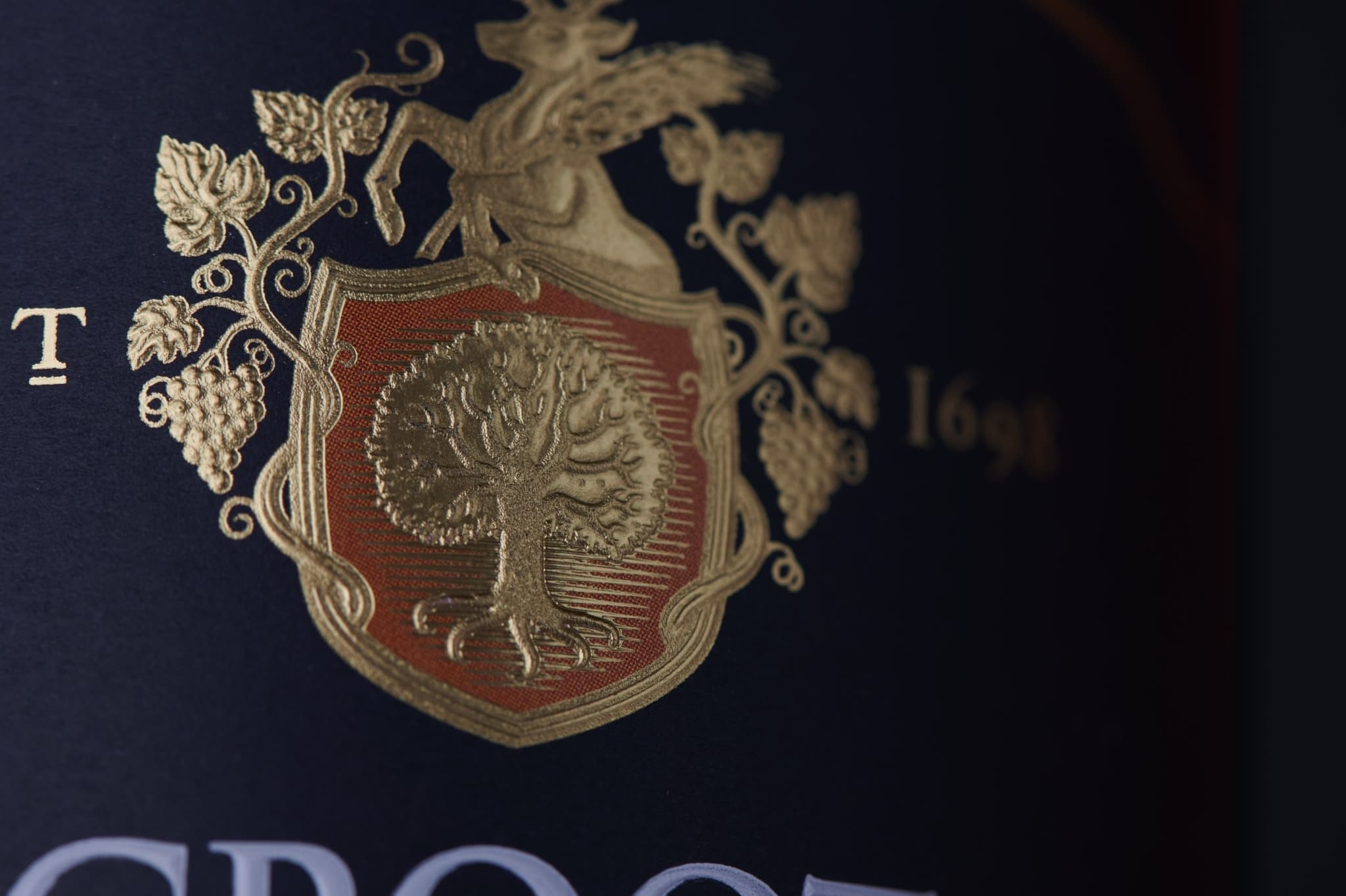
To honour this family involvement, the estate made the decision to rebrand from ‘Phesantekraal’ to ‘Groot Phesantekraal’ in 2018 – a move which coincided with the rebranding of the estate’s premium labels, which included the addition of the Brink’s family crest. The new labels were designed by Bravo Design in Cape Town and immediately impressed with its lace-like detailing: the family crest bears an acorn tree with an illustrated root structure, surrounded by intricate vine tendrils, crowned by a stag with delicate and detailed horns. For added effect, the crest also contains a spot of colour different to the rest of the label: the Cabernet Sauvignon, Pinotage and Shiraz have dark labels, but the crests have a spot of burnt orange around the acorn tree, the Sauvignon Blanc has a cream label, with a spot of green around the tree, the Chenin Blanc also has a cream label but with a spot of blue around the family tree.
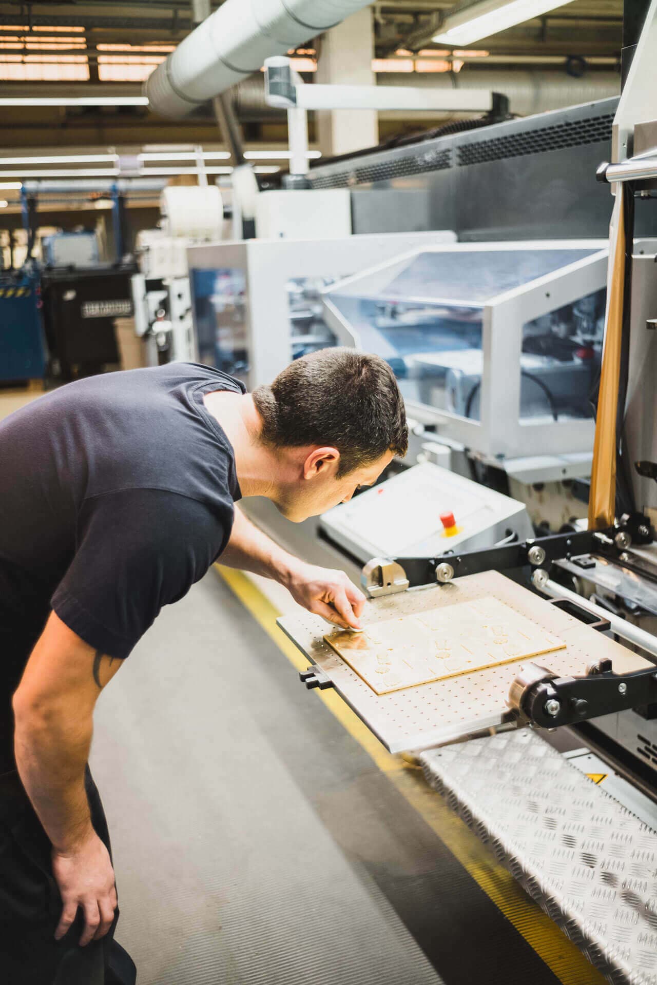
The challenge was to ensure this beautiful and intricate design would translate equally beautifully to the labels. When all this detailing, and the separate spot of colour, are introduced at a printing job, the plates have to repeatedly print in exactly the same spot – otherwise there is risk for the colour to shift out of register, which would spoil the fine artwork in the crest, and the result would be a blotch on the label.
In addition to seeking a refine touch to their labels, Groot Phesantekraal also sought a particular colour paper for its red wines: it had to be a very particular “petrol blue”, and all the labels had to have a quality feel. The challenge here was that the original intended blue tone for the red wines always came out more black in colour, and the tone also fluctuated with each edition – the brand therefore looked at its print partners to provide a workable, consistent, solution
It was like being part of a big family. I was made to feel welcome even though I’m from a small company. At Vollherbst it doesn’t make a difference whether you’re a big or small client.
Ronelle Brink
Miteigentümerin, Groot Phesanteskraal
Fine and
high quality
Step 03
Solution
Love of detail
Having worked with Vollherbst and various other South African brands, Bravo Design suggested this company’s print and label services “to avoid any possible glitches”. Says Ronelle: “We wanted a superior product, we didn’t want consumers to experience the ‘crest’ as a ‘blotch’”.
Guided by the principle of ‘lagom’ Vollherbst proceeded to supply the brand with knowledge, techniques and printing solutions to ensure this spoiling did not occur. “Vollherbst, by having access to the right machines, the right paper and by bringing remarkable attention to detail, managed to print our labels in a way that is more beautiful and neater than anyone before has managed,” says Brink.
In the area of the family crest, which forms the center of the label, a flat foil stamping was originally overprinted in black to show the details of the family crest. However, Vollherbst achieved detailing with a plastically worked out relief embossing. Furthermore, they replaced the existing, somewhat overflowing relief varnish with a sharp-edged relief-embossing with transparent foil. “It was important to us that the finishes are completely uniform throughout the three product lines (white / red / rosé) so that the consumer gets a uniform brand image,” says Vollherbst CEO, Matthias Vollherbst.
To create an added affect to the detailing of the crest, Vollherbst opted to use a combination of foiling and embossing of a gold hot foil, to ensure the “super detailing” of the crest was visible. In addition, Vollherbst added a combination of foiling and embossing of a transparent hot foil of the lettering, as well as the second frame – this provided a discreet way of emphasising the elements, while providing a light and detailed shine.
“The team at Groot Phesantekraal wanted a finish that reflected the quality of the wine, and also wanted more value through the applied printing technology and sourced materials,” reveals Matthias, “to ensure the blue tone for the red wine labels was consistent and, indeed blue, Vollherbst used the already blue dyed material ISPIRA BLUE SAGGEZZA from Arconvert and thus solved the problem. For the white wines, we were also able to suggest a paper that already comes from our manufacturer with a finely embossed linen structure. For the new rosé labels, we proposed Frozen Orion, which is typical for fresh and sparkling wines.”
With cost efficiency at flexibility at the core, Vollherbst ensured they chose a concept with tools that could easily be used for different lines.
Step 04
Personal Touch
“We decided to work with Vollherbst as we wanted consistency, we wanted to know that once the labels arrive at our estate there will be no mistakes. We sought the best quality,” says Ronelle, adding that this is exactly what they got from Matthias Vollherbst and his team. She adds: “The communication from the Vollherbst team is so thorough. They are always making suggestion to further improve our products.”
Asked whether the distance between South Africa and Germany posed any challenges, Ronelle says none whatsoever: “in fact the communication from Vollherbst is almost better than from local companies, and I get the printed labels from Germany equally quick – if not quicker.”
“In true German fashion, everything is always exactly on time!” she praises.
Request Project
We are happy
to advise you
Looking for inspiration? Have matching paper samples for this project sent to you via the wishlist or use the request assistant for an individual project inquiry.
Ulrike
Meier
Want more?
We recommend this project
Creating a true
visual impression of
Africa at its finest
Distell