Bright like
a diamond
Delaire Graff
A story by
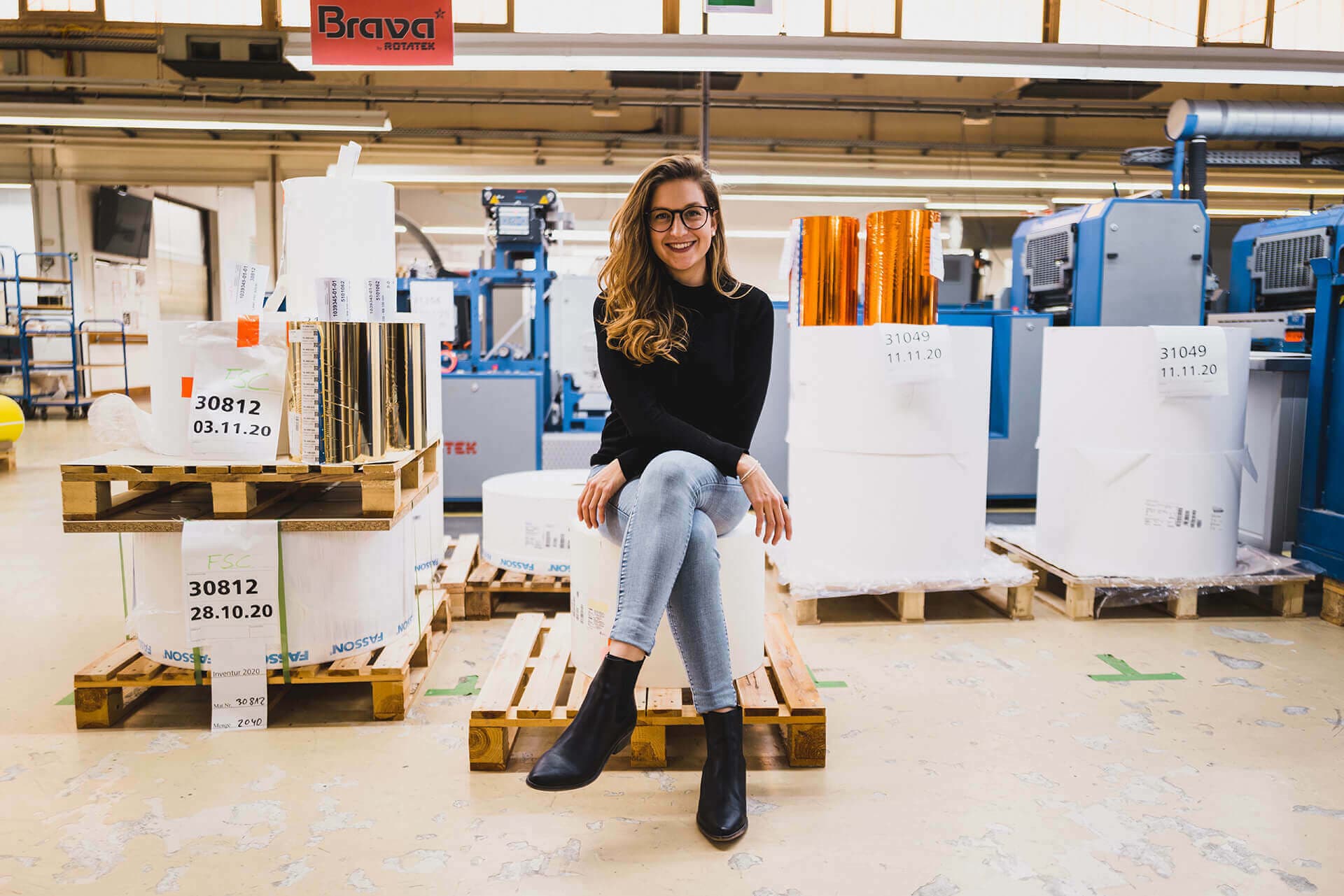
Matthias Vollherbst
Collaboration with
Delaire Graff and Brendtree since 2011
Delaire Graff Wine Estate, a wine brand owned by Graff Diamonds, one of the foremost diamond houses in the world, called for an equally polished approach to their wine labels with label finishes that would be modern and minimalistic, while still maintaining the brand’s positioning in the top echelons of luxury. Vollherbst responded with a labelling and finishing solution that provided this brand with the textural elegance they sought.
Step 01
Brand & Personality
When a jeweler
makes wine
True to its DNA, Delaire Graff Wine Estate truly is one of the ‘jewels’ of the Cape Winelands. Delaire Graff Estate has achieved what owner and globally renowned visionary Laurence Graff, Chairman of Graff Diamonds International, had in mind when he acquired this magnificent Cape Winelands property in 2003 and vowed to transform it into South Africa's most desirable art, hospitality and wine destination.
Its wines reflect this stature, within three ranges: luxury, premium and icon.
In 2012 Graff Diamonds rebranded, creating a unique opportunity for the wine brand to follow suit. This allowed for an opportunity to make the Graff heritage more present in the brand.
Appropriately, the brand’s Sunrise Brut Cap Classique was the first label to launch under the revamped logos. Named after a 118-carat yellow diamond mined by Graff, the Sunrise Brut Cap Classique’s labels set the tone and design for a full brand revamp that truly integrated the Graff legacy with its wines.

Step 02
Challenge
Discreet luxury is not a contradiction
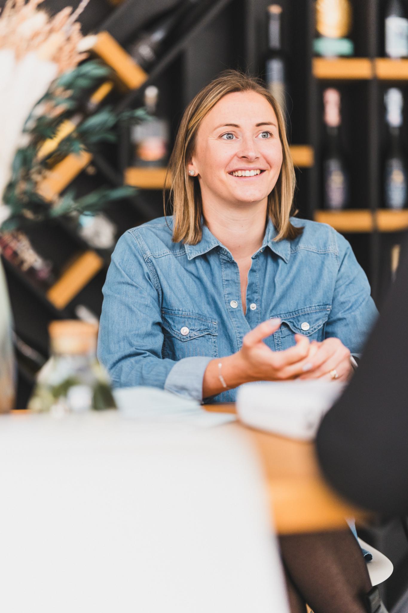
At the time, Delaire Graff Estate couldn’t find a local printing company to provide them with the luxury textural feel they were after – especially considering the detailing that was required. For the label designs to truly come to their full polished right in print, an intricate process of double embossing, transparent foiling and gradient print was required. “Could we find someone in South Africa to do these labels? Probably not, certainly not nine years ago,” muses Katherine Harris, Wine Sales & Marketing Manager at Delaire Graff Estate.
During the label revamp, the brand moved away from the more classical designs to a more modern and refined look, with the Delaire Graff ‘scallop’ icon becoming a strong reference in design.
The new labels were to be a big departure from the former white and classically styled labels. Although ‘understated luxury’ were keywords in the brief, the labels also had to convey the wines’ iconic reputation; the Laurence Graff Reserve being one of the most expensive Cabernet Sauvignons in South Africa.
This was to be a point of differentiation for Delaire Graff Wine Estate, and their labelling and print solution had to be up for the challenge.
And challenges, there were a few!
The importance of texture meant more embossing, which is difficult in itself, but in the instance of the Delaire Graff Sunburst Noble Late Harvest multiple processes on top of the embossing – debossing and two foils – added a layer of complexity. Each individual process had to run through the printing machine and every time a process was added, the plate had to press down for the embossing, debossing or foiling in exactly the same spot. Every time a label passed through the machine it also risked losing texture. The challenge was to keep the texture achieved by the embossing, even when adding a process like foiling.
The Laurence Graff Reserve had its one set of unique challenges: the label had to be in black. Black is a difficult colour to work in, as the paper either needs to be printed in black, but then it loses its finishing, or it comes out too glossy. To find a black paper to hold embossing is near impossible. The label also had to have a double emboss layer, which increased the risk of cutting through the paper if the plates pressed down on it too hard.
All of this, over a distance of some 13 000kms between Delaire Graff Estate and Vollherbst Labels HQ in Germany.
We know we can take any idea to Vollherbst and ask them to 'make it happen', and usually it comes out even better than we expected.
Katherine Harris
Delaire Graff


Successful tuning
despite 13,000 km distance
Step 03
Solution
The knowledge was the key to success
To meet these challenges head-on knowledge was key. “Vollherbst just comes with an incredible history and access to knowledge required for the layering on labels like on the Delaire labels – I’ve never come across anyone who can do what they can do. They very much are artisans within their industry,” says Katherine.
Print information
- Material: Ispira Bianco Purezza UWS, 120 g/m2
- Finishing: Hotfoil Transparent/ Gold/ Shiny Silver, relief embossing
Starting with the paper options for the black label: Vollherbst could immediately present them with a range of fifteen options for the brand’s esteemed Cabernet Sauvignon. The estate could also rely on Vollherbst Labels’ experience when it came to the detailing: “when it came to the double emboss, Vollherbst just knew how to work around the challenges. They knew how far they could push before it didn’t become viable anymore, (and risking the label),” elaborates Katherine.
Vollherbst Labels’ guidance was also key when it came to achieving the wine estate’s dreams and ideas for the Sunburst NLH. The detailing required various processes and the fear was that every process would impact the textural quality of the paper. Vollherbst brough the practicality of the process into view: to still achieve the detail the estate wanted, Vollherbst suggested a double emboss layer with transparent foiling over a grey, gradient print that still allowed the icon scallops to ‘pop’ with a 3D quality.
In this collaborative effort, Vollherbst provided direction to achieve labels that is pure class: understated luxury without glitzy foils or spot UV applications. A textural quality that allows for an elevated consumer experience, on the very best paper.
The challenge with distance was easily managed with regular communication between both partners. Katherine explains: “Generally you will be at the machine when your labels get printed to check that everything is right, but to have them printed overseas you need to have a lot of faith in your printing partner -and Vollherbst has been wonderful!”To further bridge the gap, Vollherbst would share label samples with Delaire Wine Estate that would go into the finest print details and differences – as little as 0.5% change in colour was communicated, and multiple tests were run on each label. In addition, Vollherbst would fly out with the samples, on their personal visits to the estate in South Africa.
Step 04
Personal Touch
Vollherbst has been Delaire Wine Estate’s print and labelling partner for ten years – an initial relationship which started out with 6000 labels and which has since grown into 40 000. This trust is made possible with the personal attention Vollherbst brings to the projects, says Katherine:
“We know we can take any idea to Vollherbst and ask them to ‘make it happen’, and usually it comes out even better than we expected.
Request project
We are happy
to advise you
Looking for inspiration? Have matching paper samples for this project sent to you via the wishlist or use the request assistant for an individual project inquiry.
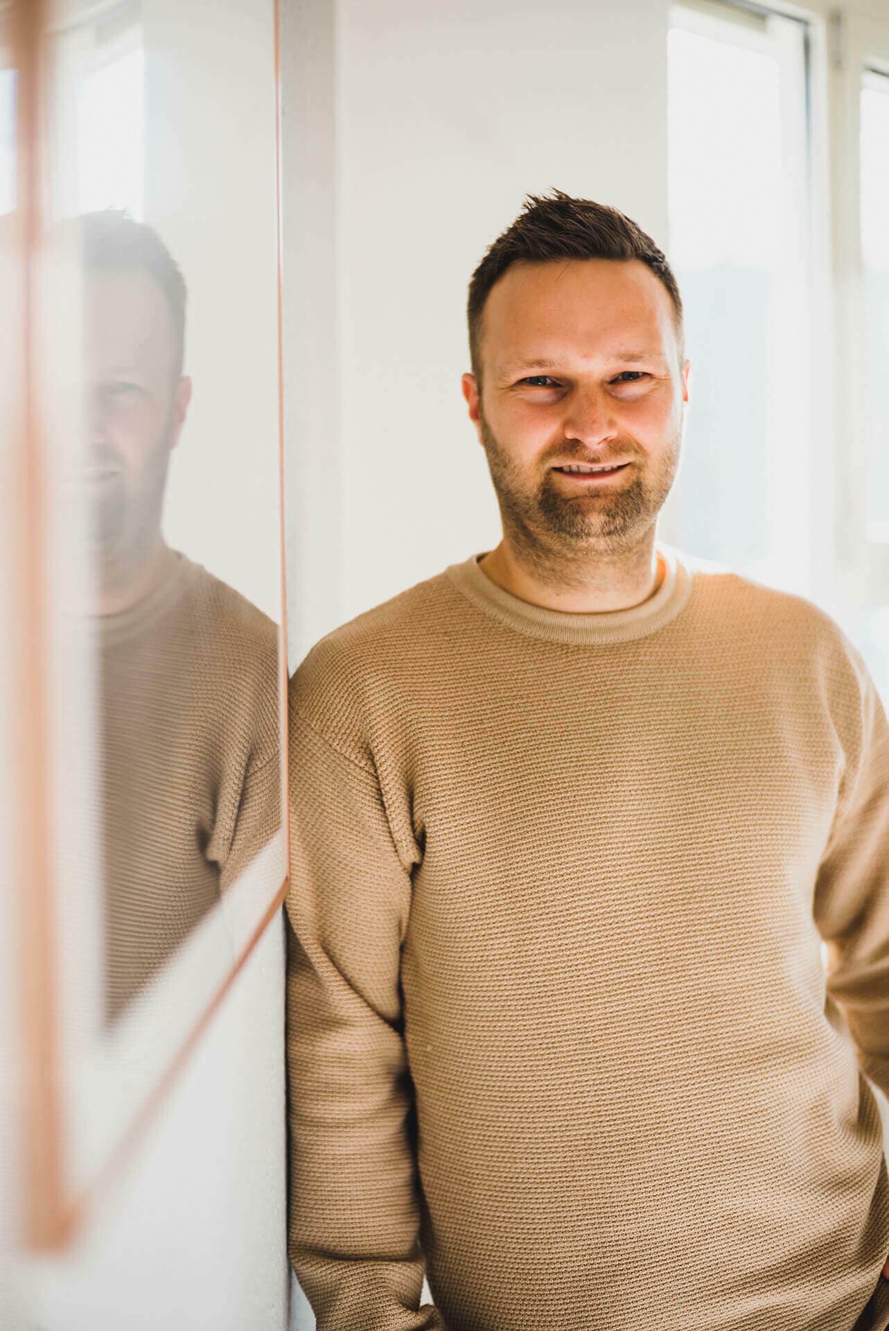
Matthias
Vollherbst
Want more?
We recommend this project
The 'little black
dress' of labelling
Inverroche Distillery