"Herz über Kopf"
Winery Josef Ambs
A story by
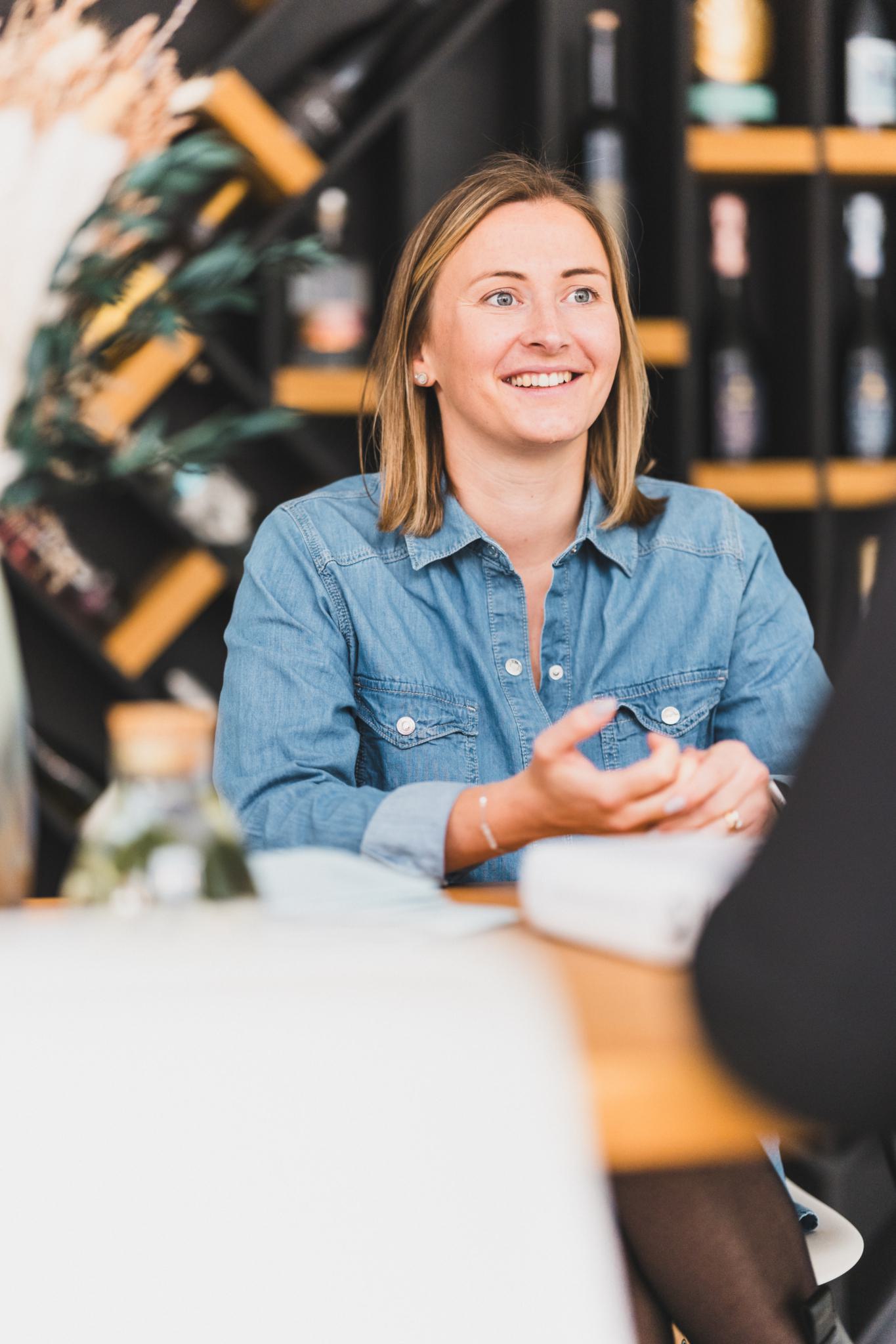
Theresa Morand
Collaboration with
Weingut Ambs and Bravo Design
since 2009
It started with his grandfather’s favourite forgotten litre-bottle of Müller-Thurgau and ended with a trendy brand. The brainchild of winemaker Andreas Ambs and Vollherbst project and marketing manager Theresa Morand, "Herz über Kopf" was launched in 2019. Encouraged by Matthias Vollherbst, they took the courageous step of appointing Bravo Design in Cape Town, South Africa, to come up with a label design for the white wine. A "Herz über Kopf" rosé and red followed in 2019 and 2020 respectively.
Step 01
Brand & Personality
Wine and
design
On a trip to South Africa in 2014, Andreas, who was working as winemaker in Baden at the time, visited various wineries and was struck by how they marketed their products. “The really successful wineries develop strong brands,” he says. The idea of a branded wine stayed with him and in 2017 he was approached by a merchant from Hamburg who was open to the idea. “I see a market for a high-quality Müller-Thurgau in a 750 ml instead of a one litre bottle,” he said.
In November 2017, Theresa accompanied Matthias on a trip to South Africa and was introduced to Cape Town-based Bravo Design. They recognised an opportunity. “We decided to give German Müller-Thurgau a chance with cool branding from South Africa,” Andreas and Theresa said. “We enjoy the wine so much. Why shouldn’t it find more fans? The grape variety deserves it.” This was the first of many Vollherbst projects Bravo Design worked on.

Step 02
Challenge
Out with the old,
in with the new
Until the 1990s, Müller-Thurgau was the most widely cultivated grape variety in Germany. It was considered reliable in terms of yield – even in difficult vintages. “It was my grandfather’s favourite wine,” Andreas says. Once prized as uncomplicated, its reputation declined over the years and it ended up being sold in one-litre bottles where it eked out an existence on the shelf.
Being labelled as “inferior” is not a glamorous starting position and Andreas’ family was sceptical about the venture, especially as it involved a hefty investment. But Andreas held his nerve. “This is such a cool grape variety. I wanted to give it a new face.”
In the vineyard, it meant reducing yields and preserving old vines. Müller-Thurgau tends to overproduce and had been a cash cow for the winery. Andreas wanted to rein in the overproduction as this was the only way to produce quality grapes to reflect Müller-Thurgau’s fine local fruit aromas and delicate floral notes.
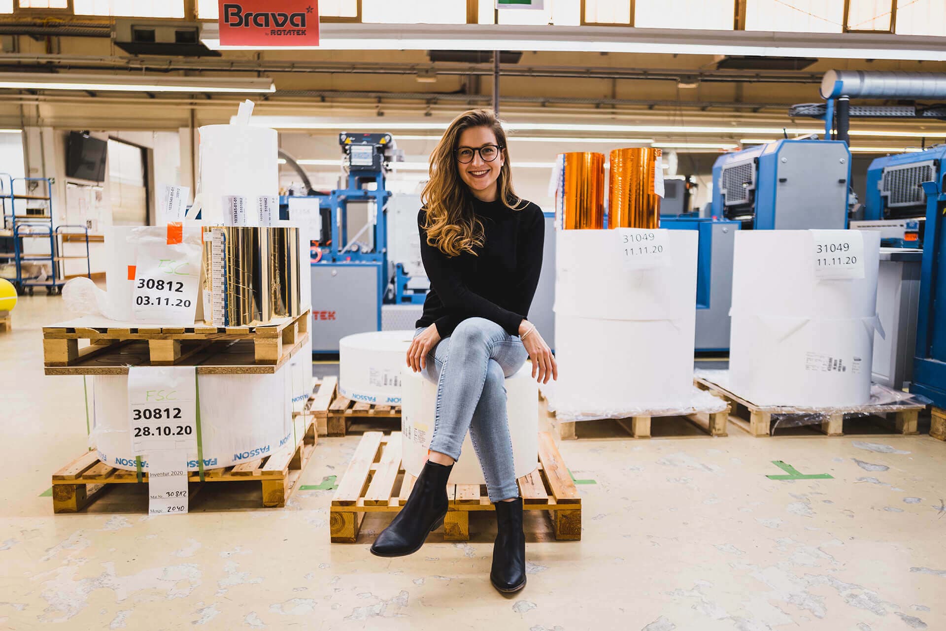
Theresa drove the brand development. “We approached it strategically with creative phases,” she says. After investigating the market, she compiled a brief that described the target audience. Bravo Design developed various concepts and created mood boards that were sent to Germany. Time was of the essence as the ProWein 2019 international trade fair was only a few months away and the new design had to be on the shelf before then.
This is such a cool grape variety. I wanted to give it a new face.
Andreas Ambs
Weingut Josef Ambs


Follow
your heart

Step 03
Solution
Stick with your gut feeling
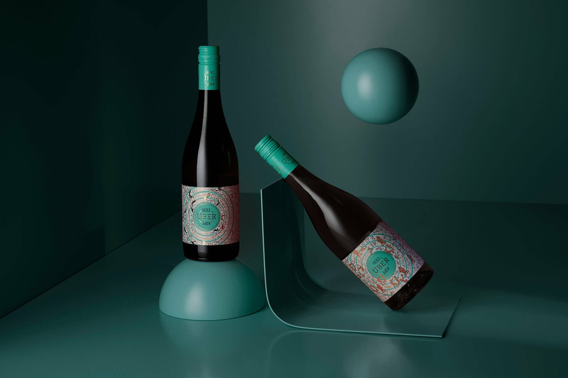
Various names were discussed, including Echte Liebe (Real Love). Against all odds, they were driven by their gut feeling. “Matthias was caught in the middle of the project and supported us,” Theresa says. In the end he was the one to come up with the name Herz über Kopf. (Heart over Head).
Informationen zum Druck
- Material: Uncoated White
- Finishing: Hotfoil gold
- Special features: 360° label
It was a good fit. The name says, “Follow your heart.” And the label design reflects this. The label wraps around the entire bottle. On the front, weightless figures tumble around the teal centre circle in childlike abandon. The longer you look at the label, the more it’s like a mantra that whispers: “Come on! Let yourself go.”
“The label is very attentive to detail,” Theresa says. “The hot-foil stamping of the many golden figures is key. The filled-in figures was a last-minute decision.” When matching the tools and printing plates, the technicians realised it would be best to print the 16 figures flying across four circles over the entire surface. The embossing tool was optimised accordingly. “Thank goodness we did this! We like it much better now,” she says. The natural Uncoated White paper forms a calm base for the playful scenario.
Step 04
Personal Touch
From one to three
A retailer in the north of Germany was enthusiastic about "Herz über Kopf" and listed the wine. Others soon followed. "Herz über Kopf" was also a success at ProWein 2018. “Initially we were cautious and only wanted to bottle 5 000 litres,” Theresa says. “But we quickly increased production.”
"Herz über Kopf" launched with a white in 2018 and a rosé followed in the summer of 2019. The wines were a huge success. “The rosé was our bestselling wine in 2019,” Andreas says. If you look closely, you can see the figures on the label are dancing or embracing. And because one couple can quickly become three – a red joined the white and rosé in 2020. Its purple label is embellished with copper foil and the figures are holding hands.
“Our target group is no longer limited to young consumers,” Andreas says. “We’re pleased that every age group enjoys our wine. And they’re affordable.”
Müller-Thurgau is a love story that’s turned into a success story. Andreas’ grandfather would’ve approved.
A haptically tangible, exciting label with great attention to detail.

Finest precision
Brought to the label by Vollherbst

Request project
We are happy
to advise you
Looking for inspiration? Have matching paper samples for this project sent to you via the wishlist or use the request assistant for an individual project inquiry.
Theresa
Morand
Want more?
We recommend this project
Monkey magic
Black Forest Distillers