Inspiration from Cistercian monks,
Alsace and Japan
Weingut Bernhard Huber
Erzählt von
Armin Kyre

Collaboration with
Bernhard Huber, a winery in Germany’s Breisgau region, is synonymous with Pinot Noir and Chardonnay. Cistercian monks brought the first Pinot Noir vines to the Breisgau region 700 years ago, while Alsatians sold Chardonnay seedlings to Breisgau in the 1950s. Bernard’s son, Julian, followed in his late father’s footsteps but soon realised the wine labels needed refreshing. In 2017, the Münchrath agency in Freiburg was tasked with the revamp. Inspiration for the top-quality paper for the labels comes from Japan.
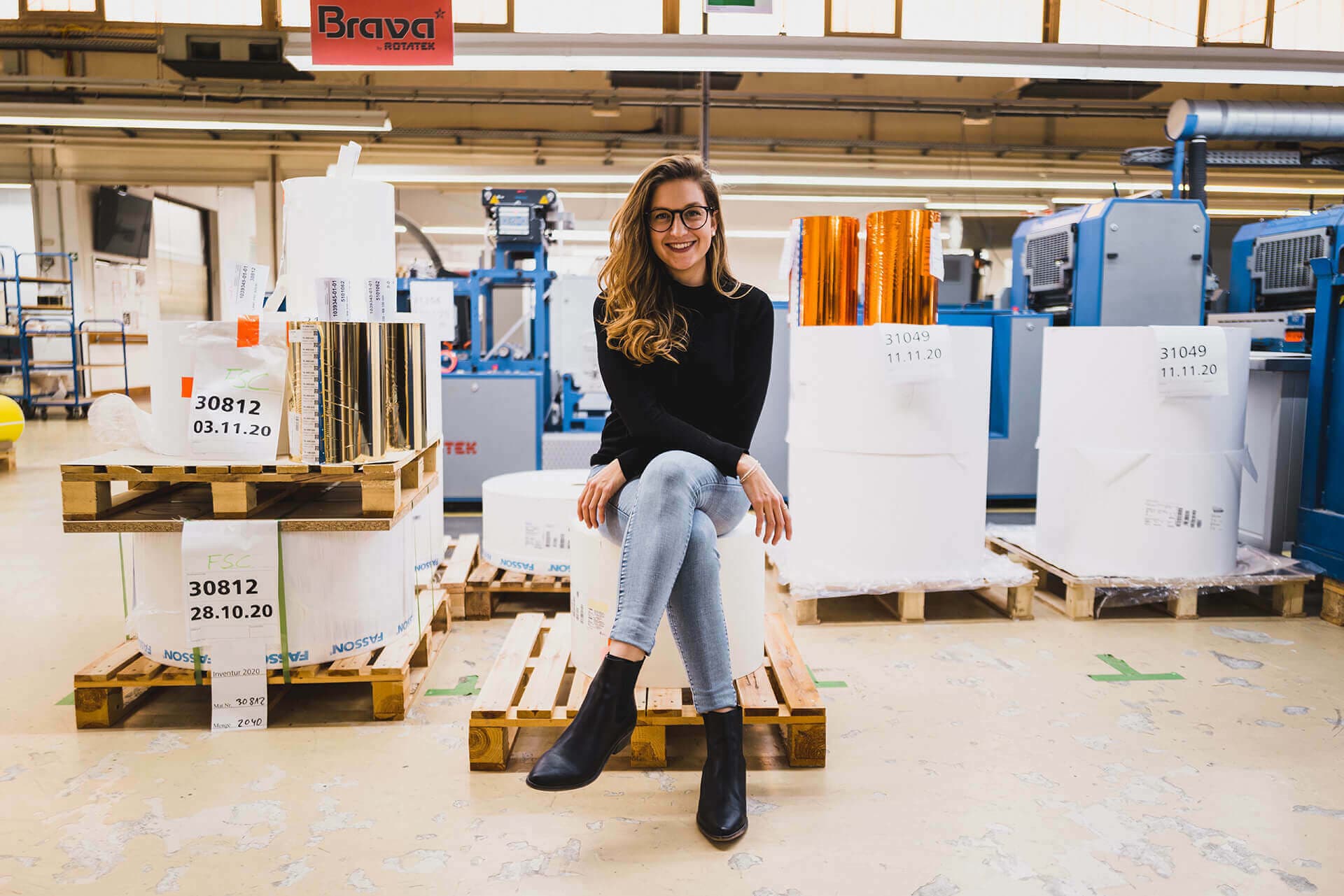
Vollherbst client manager Armin Kyre, who took care of the smooth production and unveiling of the new labels, tells the story.
Step 01
Brand & Personality
Malterdinger Pinot Noir
and Chardonnay
Winemaker Bernhard Huber founded his winery in 1987 and by the early 1990s he’d already established a reputation throughout Germany for his dry Pinot Noirs. In 1995, the winery became a member of the Verband der Prädikatsweingüter (VDP), an organisation that promotes top-quality German wines and estates, and verifies the authenticity of the wines.
Bernard’s vineyards provided him with the best prerequisites for success. Seven hundred years ago, Cistercian monks brought the first Pinot Noir seedlings to Malterdingen and the surrounding area. The region’s weathered shell limestone reminded them of the excellent soils in Burgundy. “Malterdingen was considered synonymous with good Pinot Noir 700 years ago,” Julian says. “It’s my dream to achieve this status again.” This includes continuing the red wine legacy of his late father, who died in 2014.
Besides Pinot Noirs, Julian and his mother, Barbara, value their old Chardonnay vines, which were planted not by design but by a lucky coincidence. “In the 1950s, the winemakers in the village wanted to plant Pinot Blanc, but they’d run out of seedlings,” Julian says. “So they drove to nearby Alsace to buy seedlings. But somehow the Bienenberg Pinot Blanc tasted different to the others.” In fact, Chardonnay or Auxerrois was also sold under the name Pinot Blanc in Alsace. The seedlings turned out to be Chardonnay, which at the time was not permitted into Germany. “Thanks to a lucky coincidence we have our Chardonnay,” Julian says. Chardonnay was only officially permitted in Germany in 1991 and has now become hugely popular.

Step 02
Challenge
Greater unit
Bernhard and a local artist designed the first labels for his wines and coat of arms. The vine knife on the coat of arms originally comes from that of the local village of Malterdingen. The H stands for the surname Huber and the crossbar is based on the Cistercian bar. A calligrapher drew the fine letters of the name, ending with a curved letter R.
“We still use this font from the very first label, but with a little more space in between,” Julian says. “The letters are elegant and quiet, just like our wines are reserved, not market shouters.” But he felt the labels were too shiny and lacking in cohesion. “You’d have thought our three quality levels – estate, local and site wines – came from three different wineries.” In 2017, he set his sights on a relaunch from the 2015 vintage onwards and hired Münchrath, a longstanding Vollherbst partner in Freiburg, to redesign the labels. The brief? “We want recognisability and an upgrade.”
"We want recognisability
and an upgrade.”Julian Huber
Weingut Bernhard Huber


Filigree
calligraphic font

Step 03
Solution
Colour coding and
the finest paper
The coat of arms on the original label was moved from its central position to the upper third of the label, leaving plenty of room to work with. The symbolism remained but the colours were adjusted. Fine relief varnish accentuates the black elements and precise gold embossed hot foil sits on the Cistercian bar and vine knife, and partially on the lettering. The filigree calligraphic font is now used for the designation, giving the origin a clear position. The labels are colour-coded for clarity, with red labels for Pinot Noir, green labels for Chardonnay and white labels for all the other grape varieties.
Print information
- Paper: Self-adhesive Fasson Cotton White
- Finishing: Relief vanish and hot foil stamping gold
“The Burgundy red was retained and only minimally changed,” Julian says. He’s delighted with the green Chardonnay label. “It looks very natural and reminds me of a forest in spring.”
The paper for the labels is very special, Armin says. “Cotton White is made of 100% cotton. It’s one of the highest quality uncoated papers on the market. Handling the paper is difficult as high restoring forces affect it. It’s a challenge for labellers and labelling machines.”
Step 04
Personal Touch
The choice of paper was obvious, says Julian.
“I often travel to Japan on business. The Japanese are true paper masters. I’m particularly fascinated by rice paper and Cotton White with its wonderful feel comes close to it.”
The new labels were enthusiastically received by the trade.
Julian only has praise for Vollherbst. “All the employees are well trained. Someone is always available, no matter what the query. Vollherbst offers top service.”
„The motivation for the relaunch was to authentically develop what the father Bernhard Huber had built up over 30 years. For example, the typography was modernised and streamlined without changing the charter, and the new uncoated paper reflects the winery's zeitgeist. Our relationship with Vollherbst and the Berhard Huber winery is characterised by a friendly, professional relationship - and of course a shared appreciation for Pinot Noir!"
Axel Münchrath
Geschäftsführer
Münchrath / Ideen+Medien
Request project
We are happy
to advise you
Looking for inspiration? Have matching paper samples for this project sent to you via the wishlist or use the request assistant for an individual project inquiry.
Armin
Kyre
Want more?
We recommend this project
"Herz über Kopf"
Winery Josef Ambs