a quest for the best
Vinoneers
A story by
Matthias Vollherbst
Collaboration with
Vinoneers and Bravo Design
since 2020
Vollherbst Labels recently had the honour to work with a “rebellious” South African wine brand that is unashamedly authentic in its ethos and execution. Orpheus & The Raven, a wine brand by Vinoneers, is enveloped in Greek mythology and fuelled by the creative fire of two men who escaped the humdrum of corporate life. The addition of a new label to the range presented an opportunity to further elevate a brand that was already recognised for its stand-out labels.
The brief was ‘simple’: “Absolutely no room for compromise”.
Inspired by the passion of Vinoneers’ brand owners, Vollherbst Labels jumped at the opportunity to assist this brand in its quest for excellence.
Step 01
Brand & Personality
A creative duo makes wines
with a personal touch
Orpheus & The Raven was conceptualised in 2010 by award-winning winemaker Etienne Louw and celebrated graphic designer Brenden Schwartz of BRAVO Design in Cape Town. These friends recognised a creative fire in each other and decided to direct this passion to develop a wine brand that is not driven by sales volumes, market share or consumer insight, but by a pure expression of the love for fine wine and art. With nothing in their arsenal except passion, creativity, energy, and a single wine vat, Brenden and Etienne started Vinoneers, the umbrella company for the brand Orpheus & The Raven, which now includes four wines.
Unencumbered by corporate constraints or a strict client brief, the creative duo’s vision finds expression in wine labels which introduce something refreshingly unique to the South African wine market. Rather than purely using the label to convey information about the wine, Etienne and Brenden use the labels to tell the story of their personal journeys inspired by the Greek play Orpheus in the Underworld.
At its core, the play encourages the audience to never look back; appropriate advice to Etienne who was a chemical engineer before embarking on a career as winemaker. With this as its departure, Orpheus & The Raven developed as alter-egos for the Vinoneers. Etienne, also a classically trained musician, is represented by Orpheus with his lyre. Brenden explains: “Orpheus was a demi-god who could tweak the world to his will with music. However, he had to play music to achieve this change, which reminded me of Etienne and his passion.” Brenden’s alter-ego derives from his family crest, which depicts a raven. Ravens are known to be highly creative, cunning, and smart, and is also the prominent feature in BRAVO’s logo. For Orpheus & The Raven, however, the raven represents a witty kind of wisdom and bravery, constantly encouraging Orpheus to look ahead.
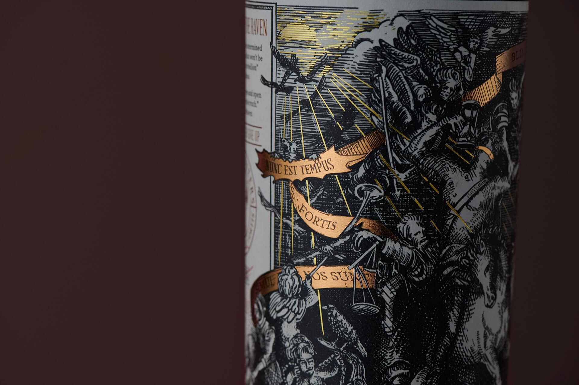
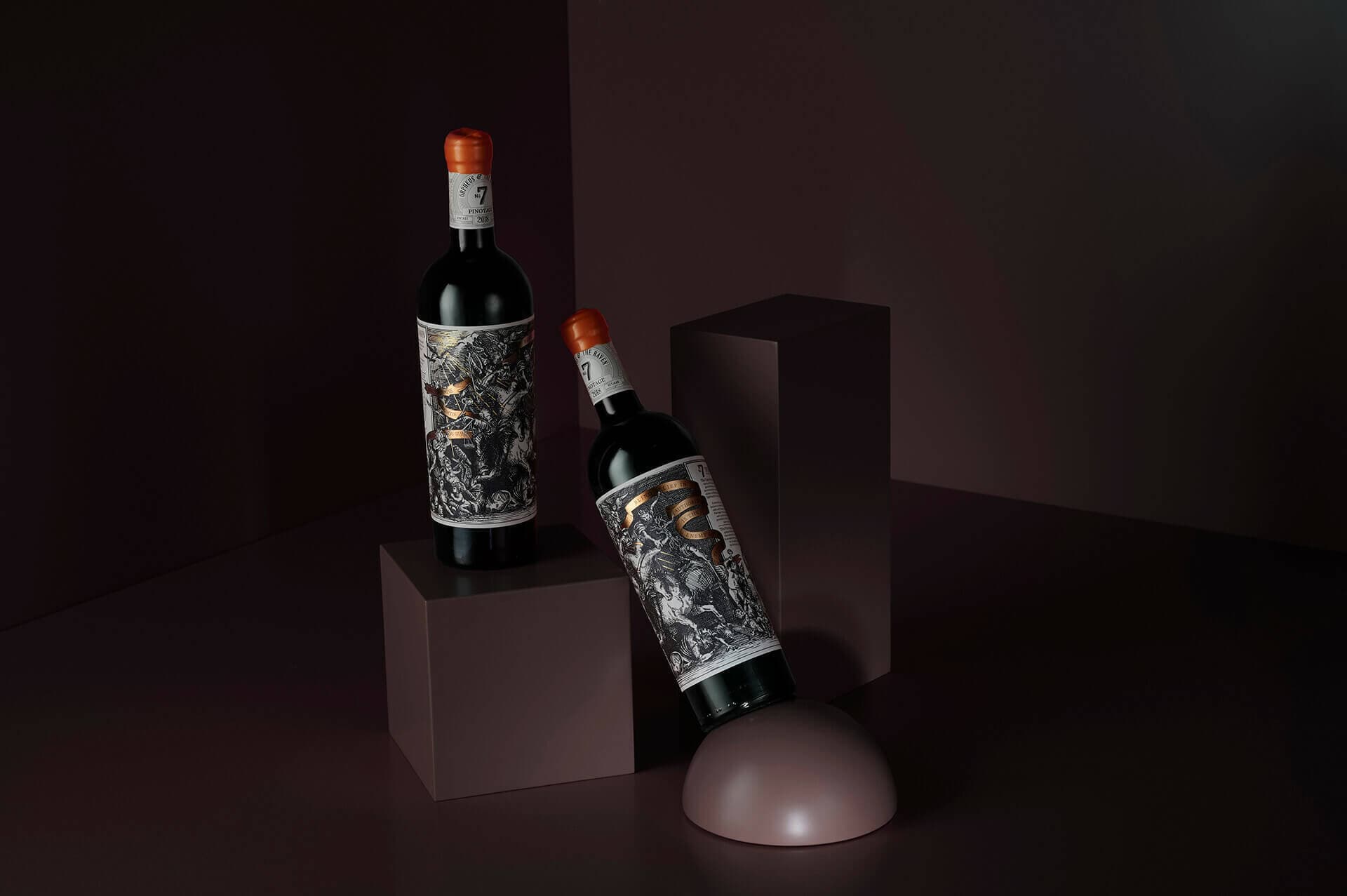
A personal message weaves through all the labels in the Orpheus & The Raven series, with each label representing a real-life experience in the life of this creative duo. The result is intricate labels bursting with energy as a single and continuous fold around the wine bottle. Each label features a hand-drawn, baroque style illustration based on the 16th century German artist Albrecht Dürer, with Orpheus & The Raven making an appearance in each.
Captivating and engaging, labels in the range make a powerful statement about authenticity. “It is a visual indulgence. With Orpheus & The Raven, consumers can feast with their eyes even before enjoying the wine,” explains Etienne. With a strong connection between wine and art, it is little wonder that Orpheus & The Raven No. 42 is recognised as one of South Africa’s most beautiful wine labels: it won the Grand Prix award at the 2018 Winemag Wine Label Design Awards, as well as three Gold Medals at its 2019 awards - the most of any producer.
Step 02
Challenge
Keep a stunning design simple
The Vinoneers expanded their range with the addition of a Pinotage, bottled under the name Orpheus & The Raven No. 7. With an award in the Orpheus range to live up to, Etienne and Brenden were unwilling to compromise on any aspects of the label of this new addition to the family.
In line with the series, this latest addition also features a dramatic hand-drawn sketch. This time, Orpheus is depicted on horseback amidst a battle scene. It also features a quote by Albert Einstein: “Blind belief in authority is the greatest enemy of truth.” A subtle reference to this wine’s rebellious founders…
With so much popular appeal, the challenge was to elevate the No. 7 label by using quality material and print techniques, as well as premium finishes. Once the design was completed by BRAVO design studio, the challenge was to gain access to a wider selection of quality paper and foil finishes – something the team struggled to find in South Africa.
“We wanted the quality of the intrinsic to be the best and most unique,” says Brenden.
Another challenge was to keep it simple. Since the design of the label is quite overwhelming, Etienne and Brenden didn’t want any “fancy applications” like embossing but wanted the labels to retain their authenticity and movement. To ensure the latter, and to honour the original etching style, it was important to ensure that even the finest lines were clear and depictable.
Finally, as a small and independent wine brand, it was extremely important that the quality of the project was met within the boundaries of a strict budget.
German efficiency
at it´s finest!Brenden Schwartz
Vinoneers

Finest lines
clear and legible
Step 03
Solution
Attention to detail and highest print quality
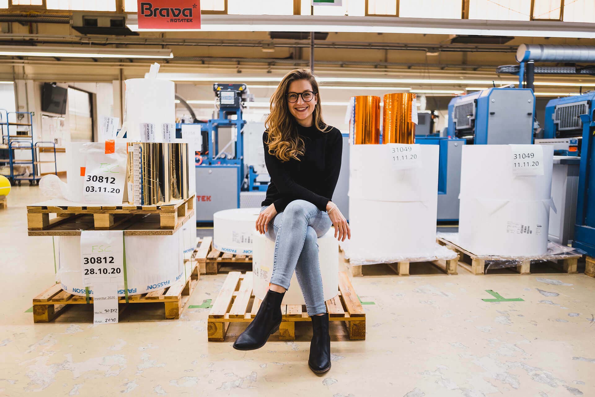
To guarantee the elevation of quality, Etienne and Brenden knew they had to seek out a label company that could give them access to a broader spectrum of paper, as well as finishing options. This solution came in the form of German company Vollherbst Labels. BRAVO design had an existing relationship with Vollherbst Labels, and Brenden knew from experience: Vollherbst would not only provide Orpheus & The Raven with the highest quality print and label solutions, but the duo would also benefit from Vollherbst Labels’ almost 100 years’ of knowledge in the field.
Print information
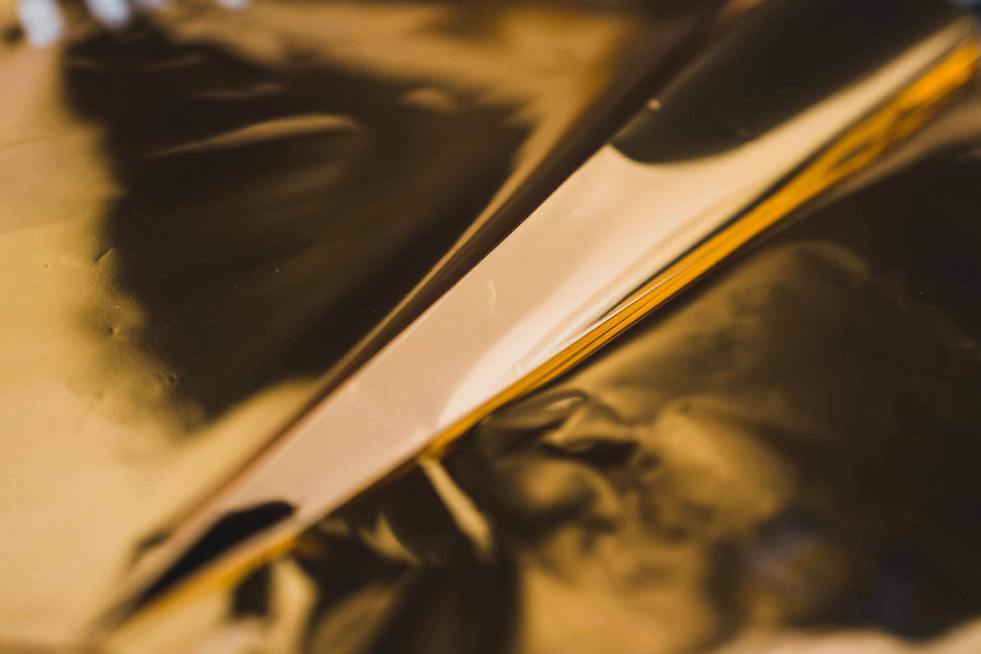
- Material: Rustique Blanc
- Finishing: Hotfoil Gold 2x, flexo varnish
Brenden and Etienne approached Vollherbst Labels to provide them with the solutions they sought:
Firstly, the size of the label informed most of the technical and aesthetic solutions: applying the wrap-around label to a bottle is a specialist process, and even the slightest increase in paper weight can further complicate matters. Vollherbst Labels made several suggestions on how to refine and tweak the label, and finally opted to use FASSON Rustique Blanc PLUS as the new base material for this big label. It would add a more tactile feel to the label, but not too much volume, allowing the label to stay smooth enough for ease of application. The added benefit was that the PLUS technology would preserve the label’s condition, preventing stains and loosening in the fridge, or even if placed in an ice bucket, allowing the aesthetics of the label to remain intact.
To ensure even the most intricate linework was visible, Vollherbst decided to print the label in litho – the highest quality level for uncoated papers. A departure from the previous labels was the addition of foil, a suggestion by Vollherbst Labels. This was incorporated as subtle strands of copper in the banner holding Einstein’s quote. Vollherbst also proposed adding a contrasting hot foil colour – a brighter, yellower gold – simulating sunrays in the background. The addition of multiple foil colours was made possible by Vollherbst’s modern machine park allowing the company to print up to three different foil colours in one print run. A refined highlight included numbered labels in red by an old traditional letterpress machine which adds a handcraft feel – perfectly complementing the making of the wine and the design itself.
All the while, Vollherbst was cross-calculating its solutions to ensure the project remain technically and economically feasible.
Asked what they valued most from the relationship with Vollherbst Labels, the Vinoneers said “transparency and attention to detail”.
Step 04
Personal Touch
German efficiency at it´s finest
A welcomed addition to the process, was the personal attention that Matthias Vollherbst, Managing Owner of Vollherbst Labels, brought to the project. “Matthias would be standing at the colour press as the labels were printed and be on the phone with us giving feedback as the labels came off the press. We didn’t expect this from the owner of a company!” reveals the duo. The Vinoneers are certain that this personal involvement further elevated the quality of the project. The attention to detail was tangible, with Matthias personally making suggestions on how to further the quality of the wine labels – suggestions which will now also be incorporated in the rest of the range.
“Matthias also picked up that the legal size of the lettering on the back label indicating the alcohol level, was off by 0.5mm. That’s the kind of precision that Vollherbst Labels brought to the label,” said Etienne. It was this intense collaboration between Vinoneers, BRAVO and Vollherbst Labels that has allowed correct and speedy decisions – quite impressive considering the more than 9,000 kilometers between Vollherbst’s production in Endingen, Germany, and the Vinoneers and BRAVO in Cape Town, South Africa.
A smooth and positive experience, which the Vinoneers summarised as follows: “German efficiency at its finest!”
Request project
We are happy
to advise you
Looking for inspiration? Have matching paper samples for this project sent to you via the wishlist or use the request assistant for an individual project inquiry.
Matthias
Vollherbst
Want more?
We recommend this project
Werewolf in
the wine cellar
Winegrowers
Cooperative
Wolfenweiler